
Hi everybody,
Today, here is a little post about the Graphical User Interface (GUI) of the game. More specifically about what is called the HUD (Head Up Display), which is the interface displayed WHILE PLAYING (this is NOT the menu). You will see I ask myself looooots of questions even for a “simple task” like this one. But… I have to, because this HUD will always be visible on screen during the whole game. It has to be the best possible (help the player without disturbing him/her from the actual game).
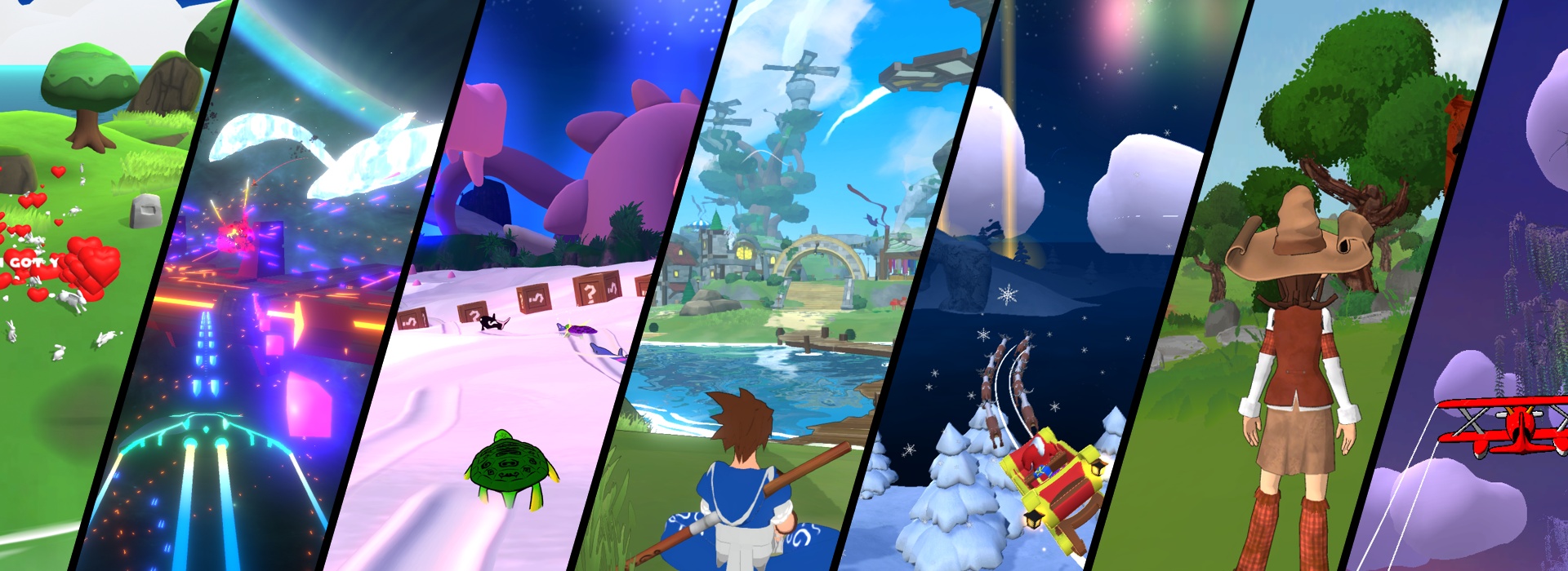
Of course, when I try to create a video game, my first reflex is usually to look at how other people do it and try to understand/analyze it. So I checked out the HUD of a few of my reference games: Beyond Good and Evil, Zelda (2 different episodes), Assassin’s Creed, Okami, Torchlight and Darksiders.

I – Problems
First of all, while designing an interface, the first thing to think about is “What do I show to the player”? This is highly dependant on many things:
– Game “rules”: does the hero have a life/energy information? Does he have other equipment that may need this kind of representation (shield energy)? Can he use many different equipments (bow, knifes, gravity gun, love gun, whatever…)? If so, can he use many at the same time and how can I show efficiently which ones are selected?
– Design choice: Do I want a very simple representation (but easily readable) or do I want something more elaborated (hence less readable), but that may fit better with ingame graphics and improve immersion? How can I represent this information (Numbers? Letters? Colored bars/drawings? Icons?)
– Help level: Do I want a very complete HUD that explains everything to anybody who plays for the first time, or something aimed at people who are already familiar with gaming? The first one is more complete but eats more space on the screen… This may highly impact the difficulty level of understanding the game, but also the difficulty of the game itself (imagine I don’t show the hero energy bar… This may be very stressful for the player).
– The control choice: Do I want my game to be playable with only one action button? or two? or three…? More action buttons = more complex actions (jumping while aiming at some guy with a bow for example, which is cool 🙂 ) = more complex HUD to explain it (show the target cursor + explain how to shoot an arrow + how many arrows are left?).
II – (A) Solution
Of course there is no “perfect answer” to this problem (as it is usually the case for a lot of problems). Only compromises… depending on the kind of audience, the kind of game… and above all my time and abilities/skills.

Thus, I chose something simple and quite “modern-looking”:
– On the upper-left corner, I show characteristics related to the hero him/herself: life and force. The player may understand which one is which by playing and seeing them evolve. It enables less cluttering information. It’s not very difficult to understand, and once you get it, the representation is minimal and doesn’t bother you during the 99% rest of the game. And why the upper-left corner? Because this is most important information and it the first thing you see when you try to “read” the HUD… in the normal reading way (left to right, top to bottom).
– On the upper-right corner, I show equipment information (one for each mouse button). Why right-side? Because usually mouse is on the right-side of the keyboard, hence it is easier to identify that this info is linked to the mouse (sorry for all left-handed people… 🙁 ). Maybe I’ll use a third one with the middle mouse button… I’ll see if this is necessary later. You may notice that the “main” equipment (left button) is bigger, because used more often.
– On the lower-left corner, I display… money.
– I chose to lower the dialog box size, because it took too much space on the previous version (you can check the tutorial demo to see it). Moreover, it is easier to read lines when there are not too many words on the same line (check your favourite book, you’ll see ;), and that’s why newspapers present texts in many columns.

You may see I used some 50% transparent black rectangle backgrounds with white text/icons. This ensures at least a 50% contrast readability whatever is displayed behind, because HUD must be readable in every virtual place of the game. At the same time, it enables you to see through it which improves immersion.
I also use some simple orange “circles” to add some kind of “techy-modern” look to the interface. Orange is a color I may have chosen because I like the interface of Blender (a 3D software I use), and it has some kind of visual uniqueness (not very used, except in the very stylish Remember Me). Maybe I’ll change the theme in the future… For representation of information, I chose to use a lot icons because it is very easy to understand, and it doesn’t need any translation. For example, I used a credit card icon to represent the money information… which (to my surprise) may be seen as the € symbol with the orange circle around it. Fun 🙂
That’s all for this… huge post. Thanks for reading until here and I hope it was intructive for some of you 🙂
See you!